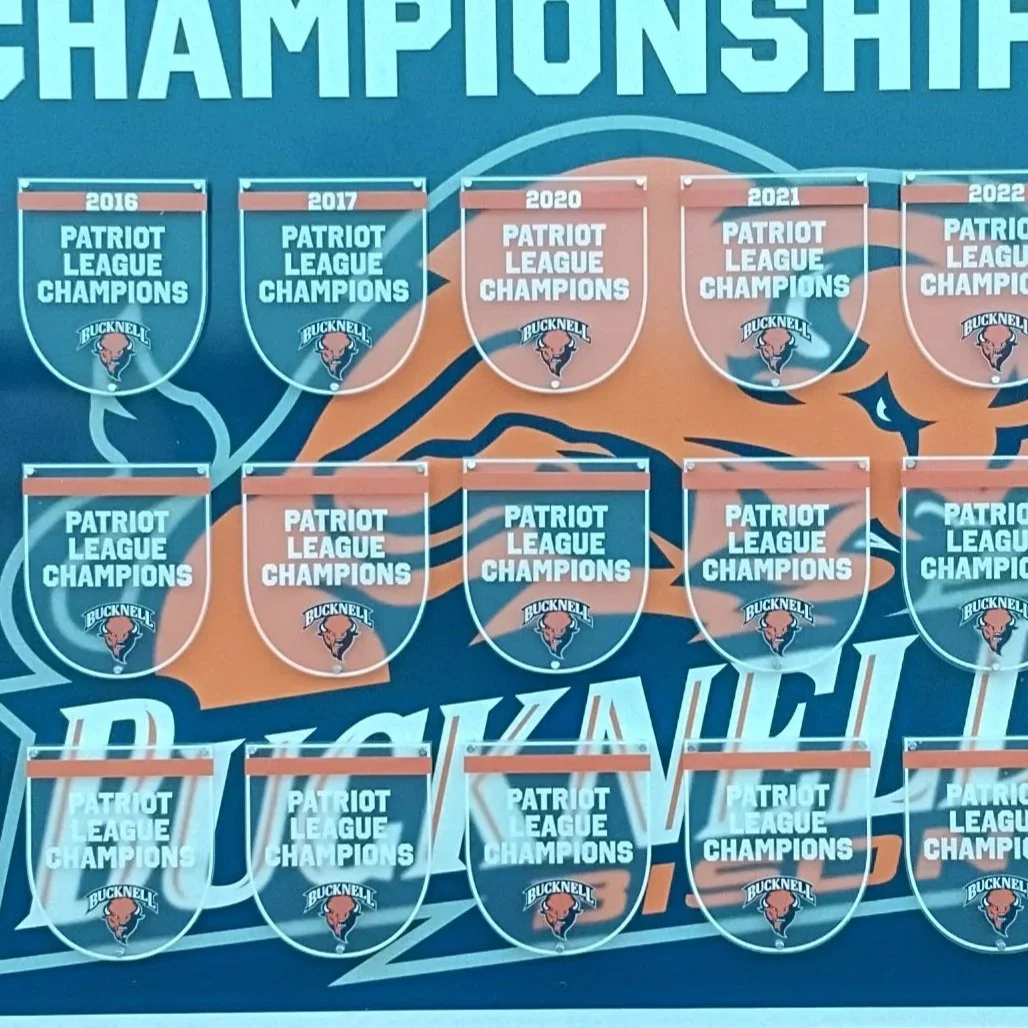
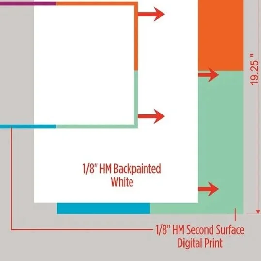
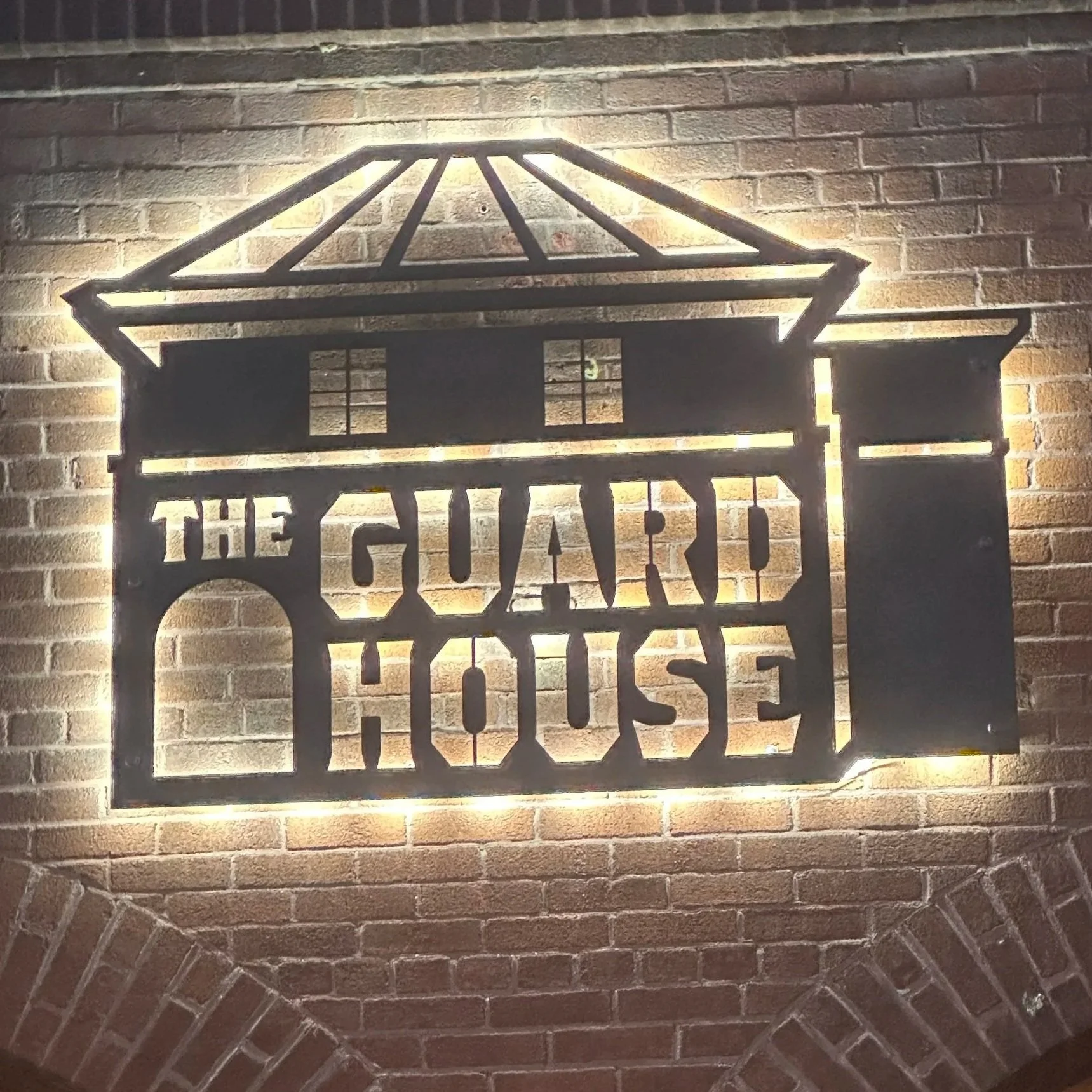
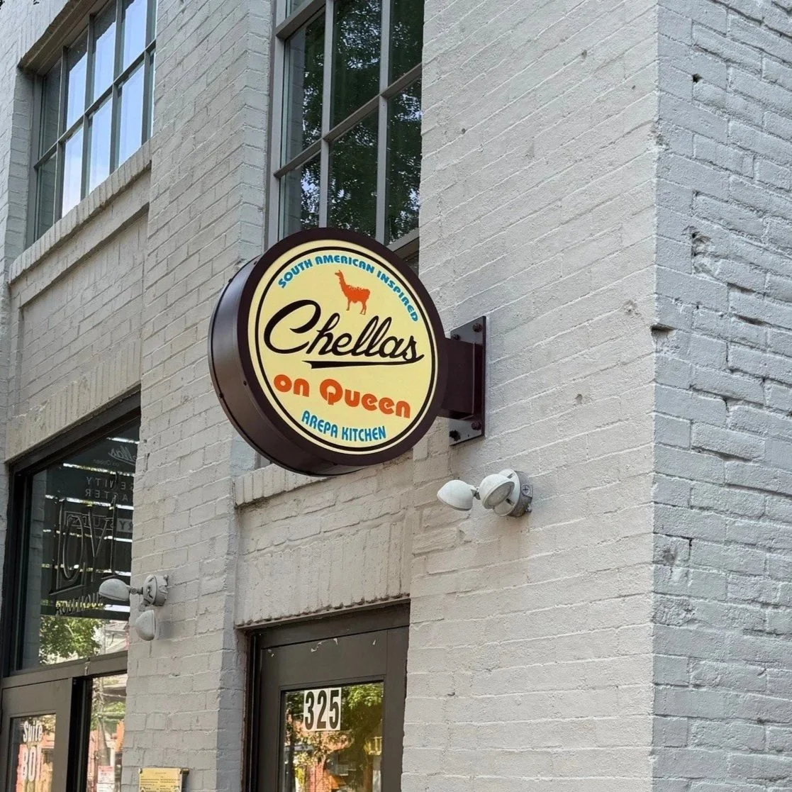
PORTFOLIO

oola

INTERIOR & EXTERIOR
ILLUMINATED SIGNS

For Oola, I developed a cohesive package of exterior and interior illuminated channel letters that reinforce the brand’s bright, modern identity across multiple locations. The exterior signage provides high visibility with clean, dimensional forms and vibrant illumination, while the interior letters create a welcoming focal point at each store’s counter. These sign packages were engineered for consistency, durability, and ease of installation—supporting a nationwide expansion with locations installed from Pennsylvania to Idaho. This project showcases my ability to manage branded signage programs at scale while maintaining quality and visual continuity across diverse architectural environments.

TREAD HOUSE

The wall wrap features a bold, energetic design that instantly sets the tone for the gym environment. A flowing pattern of blue and teal abstract lines creates a sense of movement and momentum across the entire wall, while large, high‑contrast lettering delivers the motivational message: “WORKOUT HARD • BE A GOOD HUMAN.” The bright yellow smiley face integrated into the typography adds a friendly, uplifting touch. Positioned beside the gym’s entrance, this wrap not only enhances the space visually but reinforces a culture of effort, positivity, and community from the moment members walk in.

Below is project’s spec sheet to highlight the production details behind the design—showing how scale, materials, and installation planning informed the final wall wrap.

wall wrap

union community
care

For this medical facility, I designed and coordinated a full suite of ADA‑compliant signage featuring a custom multi‑layered build that balanced durability with a clean, modern aesthetic. Each sign was engineered to meet strict federal ADA requirements for readability, contrast, tactile lettering, and placement—ensuring accessibility throughout the space. Managing this project across multiple locations required detailed tracking and organization; I used site blueprints, elevation plans, and on‑site visits to verify exact sign counts, positions, and code‑approved mounting heights. The result is a cohesive, fully compliant signage system tailored to both the brand and the environment.

ADA SIGNS

Chellas

projecting sign cabinet

This projecting illuminated sign cabinet was designed to give the restaurant a strong, street‑visible identity while complementing the historic brick façade. The circular form and warm color palette were intentionally chosen to reflect the restaurant’s welcoming, vibrant Peruvian brand. Positioned perpendicular to the building, the sign increases visibility for foot and vehicle traffic, especially along a narrow sidewalk where traditional wall signage could be missed. This project highlights my approach to merging brand expression with practical wayfinding and environmental design considerations.

I included the spec sheet to show the essential fabrication details—how the design translated into exact materials, dimensions, and lighting specs for production.

homestead village

wall wrap

This large‑scale wall wrap was designed to bring warmth and inspiration to a retirement community’s main corridor, featuring custom artwork I created specifically for the space. The landscape imagery was crafted to evoke tranquility and a sense of connection to nature, serving as a meaningful backdrop for the community’s donor recognition elements and legacy messaging. I developed the full layout, ensuring the artwork flowed seamlessly across the full wall while integrating existing plaques and architectural features. This project reflects my ability to create original visual environments that elevate shared spaces and support the values of the communities they serve.

Illuminated Monument Sign

home one

This monument sign was designed to make a bold impression, featuring a custom‑sculpted hammer integrated seamlessly into an illuminated cabinet for strong curbside visibility. The dimensional element adds character and instantly communicates the brand’s connection to craftsmanship, while the clean, modern layout ensures readability from multiple approaches. Engineered for durability and nighttime impact, the sign became a standout project—ultimately being featured in Sign of the Times magazine for its creative fabrication and eye‑catching execution.

the guard house

laser cut steel signs

This illuminated sign was crafted from precision laser‑cut steel, creating a clean, dimensional silhouette that stands out beautifully against the brick façade. The logo itself is a simplified architectural illustration of the very building it’s mounted on, designed to echo its distinctive roofline, arches, and historic character. Backlit halo illumination adds depth and drama, casting a warm glow that enhances both visibility and atmosphere in the surrounding walkway. This project showcases my ability to combine custom fabrication techniques with site‑specific design to create signage that feels truly integrated with its environment.

the tipsy hen

trailer wrap

This full trailer wrap was designed to give the mobile bartending company an unforgettable presence on the road. I created the brand’s logo and tagline, developing a playful yet edgy identity centered around the illustrated “Tipsy Hen” character. The wrap uses a textured brick‑wall background and oversized graphics to maximize visibility and personality from every angle. This project showcases my ability to build a brand from the ground up—crafting both the visual identity and the large‑scale environmental application to create a cohesive, attention‑grabbing mobile experience.